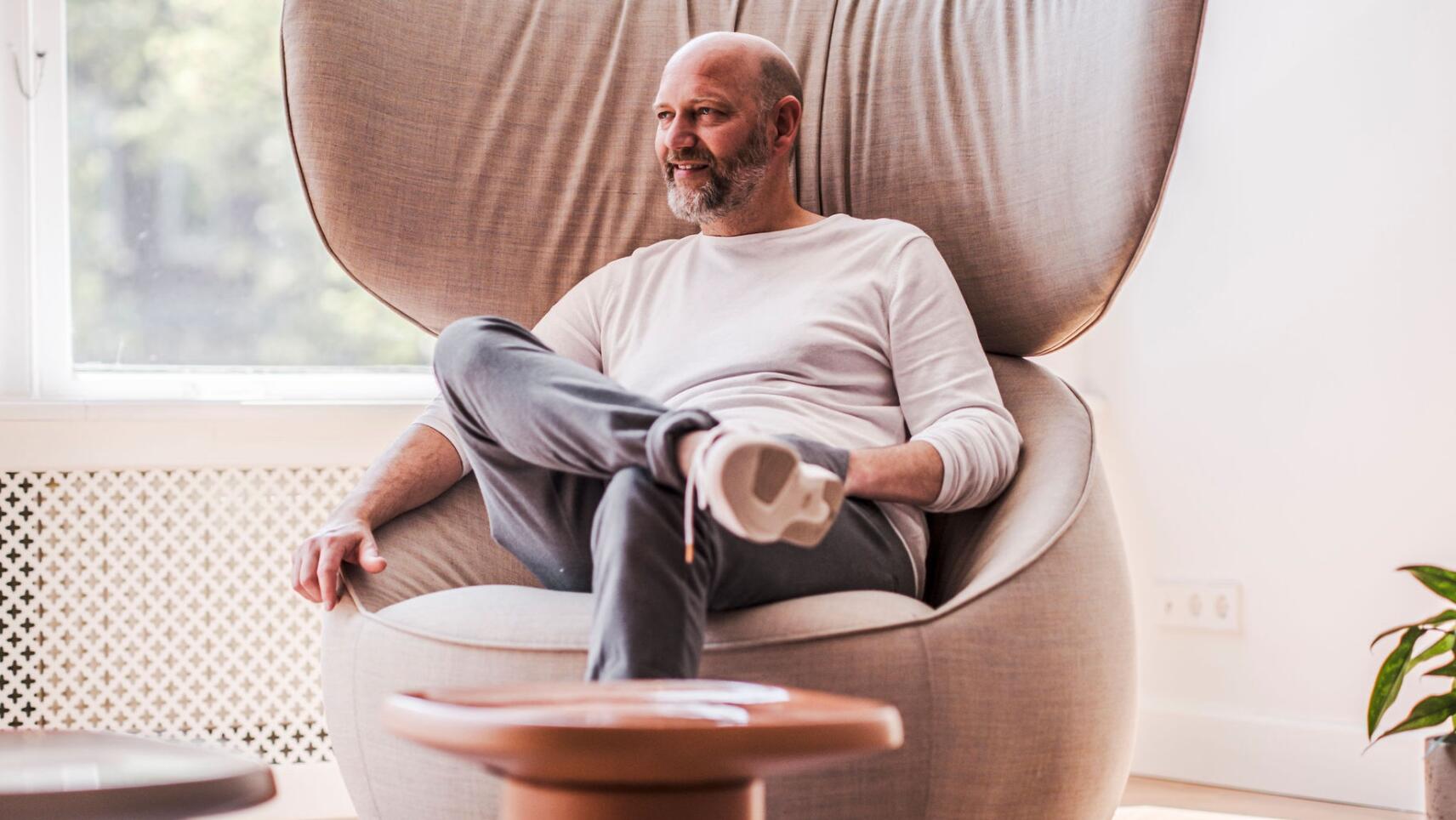
Renowned Dutch architect Casper Schwarz was commissioned to create the OCCO flagship office from a home in the center of Amsterdam. In a longer interview, Schwarz talks about how the terrible acoustics were solved, why he liked working with OCCO, and what inspired him about the whole process.
What is the story of the OCCO office?
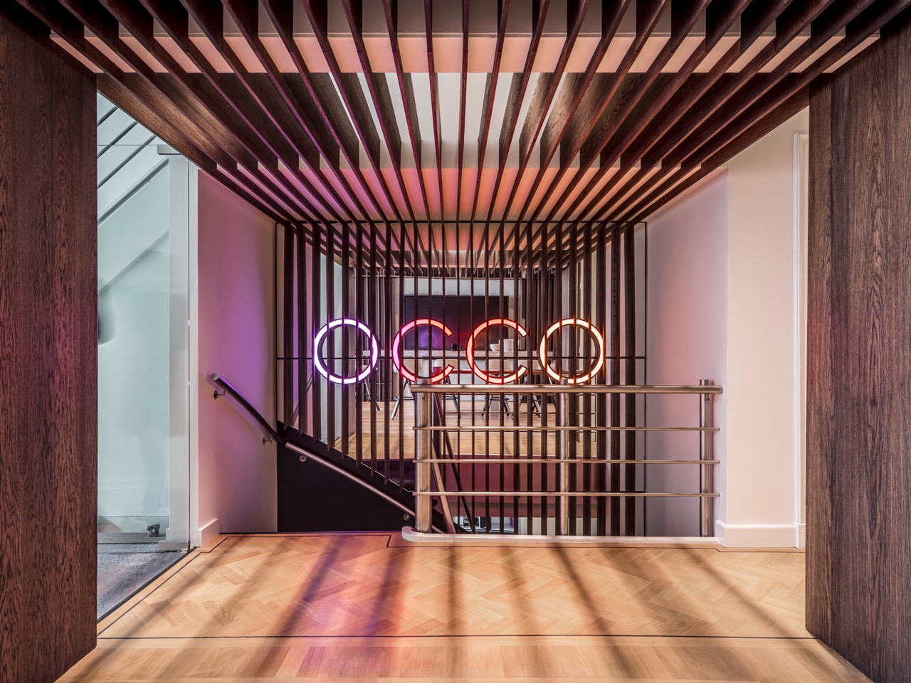
OCCO decided to create an office that would not be ordinary and would be a part of the historical center of Amsterdam. Of course, the goal was also to attract architects and clients to come and see the office. Secondly, it was important that the office fit into the surrounding milieu with restaurants and cafes.
There were several places to choose from, but I really like that they decided on a classic Amsterdam canal house. It has a vertical layout: the higher the floor, the lower the height of the room.
The building is located in the city center by the canal, but it is very quiet there, and the traffic noise does not disturb. At the same time, on the other side of the canal is one of the main streets with the busiest traffic in the city, where you can see both the office and the OCCO logo, the bright colors of which make the building recognizable from afar.
The building was renovated shortly before OCCO started renting it. When we moved in, everything was brand new, but the rooms were completely empty. It was renovated with the idea that it would be an office, but it lacked the usual office atmosphere.
What inspired you in this design work?
It was very interesting for the whole team. OCCO had prepared a guide for us entitled “Happy Space”. The rooms had wooden floors, which created a homely atmosphere. So we had a good base on which to create a really nice office. There you got the feeling that you are visiting OCCO’s house rather than an office – it leaves a very welcoming impression, it is spacious and warm, the building is characterized by large windows and lots of light. There was no classic cold lighting or typical office ceiling.
How difficult was it to create an office in a home environment?
We didn’t want to create a classic office space – the fact that it was a home atmosphere was the trump card. Of course, we didn’t set out to create a real home, because it’s a completely different space, but the combination we ended up with is very interesting. If the whole process is thought through and well organized, everything will go smoothly.
What were OCCO’s expectations and wishes?
When a client orders work from an interior designer, they have assumptions and demands, but the final result is not yet in sight. The whole process is a search. I would say that the expectations were fluid, so to speak. What does it mean? The result was to be a space that is both an office, a showroom and a place for organizing events, at the same time striking, homely, happy and functional.
We were tasked with creating an OCCO-like place, keeping in mind the specifics of the building. We also had to take into account that OCCO’s partners are interior architects and designers who often visit the office. If, upon entering the room, one did not feel good there, a certain distancing would immediately occur. We had to find a balance with the classic OCCO style and at the same time create an environment that would also appeal to interior designers.
So the whole combination had to be homely, free, inviting, digital and at the same time human-friendly. We had to solve the puzzle of how to connect the corners of the room with different functions, without separating the rooms from each other. Everything had to fit together – like cooking a big pot of soup, where you add different ingredients and in the end everyone has to like it.
But that’s the job of a designer – you start looking for logical solutions so that everything fits together. We had to create a well-thought-out route: when you enter the building, what is the first thing that greets you, where do you want to have privacy and in which corner could there be more synergy.
The good thing was that we were given the freedom to come up with the design ourselves. Yes, we like clients with a critical mindset, which sparks interest in what we do. But at the same time, it’s good if we have our hands free, so that we don’t have the feeling that we are completely in the grip of the customer.
We are happy when we get good feedback when we hold a meeting with customers. This is how we know if we are moving in the right direction. Expectations and wishes may thus change during the process. But, this too, is good – this way we are together with the client on this journey and together we can reach a final result that suits everyone.
What were the main challenges of this job?
One of the main things that caused difficulties was the spatial planning. As you enter the building, you are first greeted by a large open portal. The portal is the place where you enter and leave the room, i.e. the starting and ending point. Since it is an important part of the room, it must be well designed. It took us a long time to figure out how to connect the portal to other parts of the room.
In the end, we redid the whole plan and it immediately became much easier and more logical: we made the portal the center of the long room and we were able to logically connect all the different parts of the room. It turned out that we had restored the original layout of the building that was there before the renovation. The only difference was that we left the room open and removed the sliding doors.
Another challenge was the building’s acoustics. To be honest, it was terrible to be in the room at first, because it echoed everywhere. We had to find a good solution to this problem as well.
How did you put this whole puzzle together?
We chose wood to design the portal to bring even more warmth to the room. We started working with slats, and that’s how we found a solution to get rid of the terrible acoustics. It is believed that only soft materials improve acoustics. However, we discovered that using wooden slats, it is possible to interrupt the echo’s journey in the room.
Next, we started to choose materials, colors and furniture design. There, the OCCO logo was exemplified by a very good use of color. We decided not to use the pure colors of the logo, but their softer variations, that is, we chose more modest tones that would match the colors of the logo. For the curtains, we used softer and more natural materials, which would balance everything and create a smoothness in the room. It worked perfectly with the wooden floor that was already in the building. The whole ensemble leaves a very warm and timeless impression.
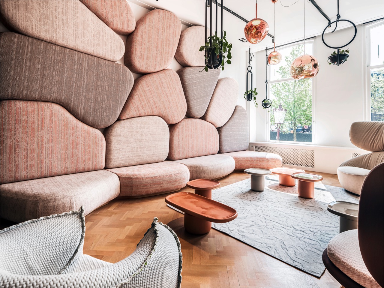
Then we started working with furniture. We told OCCO that if you ever want to move or replace the chairs, for example, that’s fine, but if you start changing everything, the whole architectural concept collapses. Therefore, we had to find at least one element that would always remain in the room. For this purpose, a sofa with a stone motif started from the wall, which has such a strong character that no matter what other chairs you place next to it, the concept will not collapse. A sofa with a stone motif always remains in the foreground.
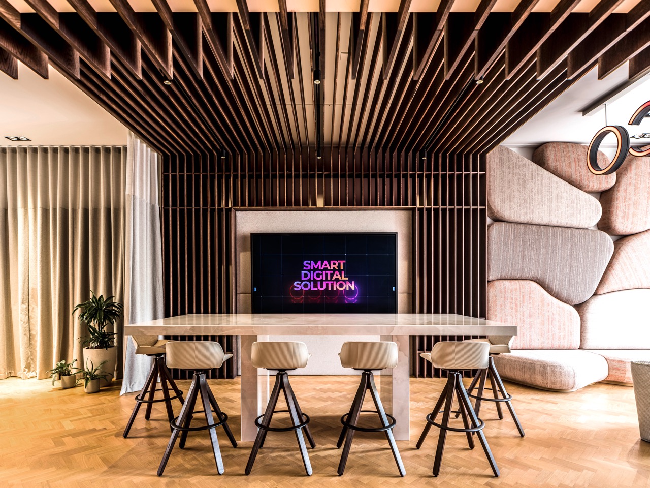
Attached to the wall in the middle of the room is one of the main elements of the office – a large screen that presents the OCCO digital platform. As it is both a meeting point and a place to introduce products to customers, we added a multifunctional table in front of the display. We had to consider that it would be unshakable and solid – like a stone altar that cannot be moved. You just have to accept that it’s there. If we had chosen a movable table, it might happen that the center of the entire office would shift at some point. If you move the furniture, the concept disappears. Therefore, a non-moving table was very important.
How hard is it to create a unique design?
There is no question that it is always difficult. But the longer you work on the project, the more unique it becomes. At the same time, we needed elements that were recognizable. One of them is the already mentioned sofa with a stone motif, which is very unique. But such things cannot be forced – you just have to be committed to the project.
A sofa with a stone motif was created, for example, like this: I was up early one morning because I just couldn’t sleep, and then I started thinking about furniture and design, and suddenly an image of the stones on the wall popped into my head, and that’s how the idea was born. Then we tried it in the studio and it worked really well.
Perhaps the question is not how difficult it is to create something unique, but how important the project is to you, how involved you are in it, or how much you want to create something good. That’s how it goes, and that’s why we love our jobs.
What did you learn in the process?
The fact that the acoustic effect of the slats can be very good. We learned how much this contributed to the acoustic climate.
It’s hard to pinpoint specific things because all the little fragments are part of the process and ultimately the whole process was a good lesson for us. If both the designers and the client are ready to work hard for a good result, you will be able to create more than you thought at first. I found confirmation that good cooperation always pays off.
What is your favorite element in the office?
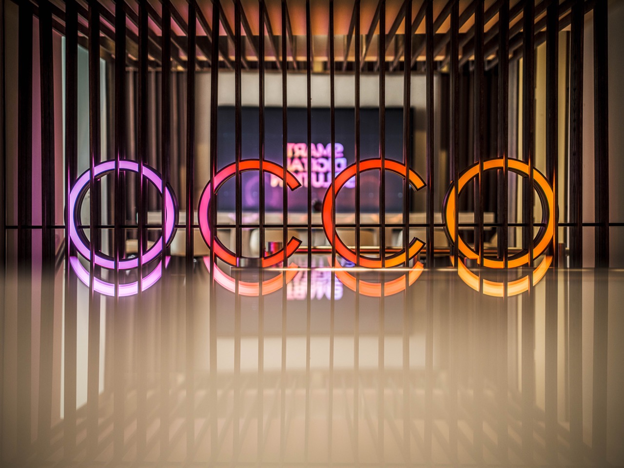
There are two of them: a sofa with a stone motif and mirrors behind the logo by the stairs. With the last trick, we were able to create a very interesting spacious solution, which is an important part of the design. The mirror also shows the introduction of OCCO’s digital platform, which is very cool.
Please list four suggestions that are often overlooked when designing an office space.
1. You should not think of an ordinary office, but think about what an ordinary person needs.
2. It is important that the result is an organized room, so you need to find elements that help to maintain the spatial solution (such as a table carved in stone)
3. Use one detail versatilely, for example we were able to solve the acoustic problem with slats and use it through two floors
4. Try to create a space that is not cold or dreary, but where everyone feels good.

